Back to home

Screen Ruler

I was a big fan of Zeplin and wanted something similar for live webpages. Screen Ruler started as a measurement tool. I soon added a side panel to show more information about the selected element.

I taught myself JavaScript and launched it in March 2024. Since then, I’ve added CSS inspection and editing, plus a workspace for checking layouts at different screen sizes.

I design and build it on my own. The side panel has been a particularly interesting challenge: there’s a lot to explain about a webpage, and very little horizontal space to do it.

Product
Screen RulerScreen RulerA Chrome extension for measuring spacing, inspecting styles, and editing live webpages.
Role
Creator, design, engineering & growth
Year
2024–present
Platform
Chrome extension
Website
screen-ruler.com
Weekly active users
60,000+
Impressions
5.9m
Total installs
100k
Average rating
4.3
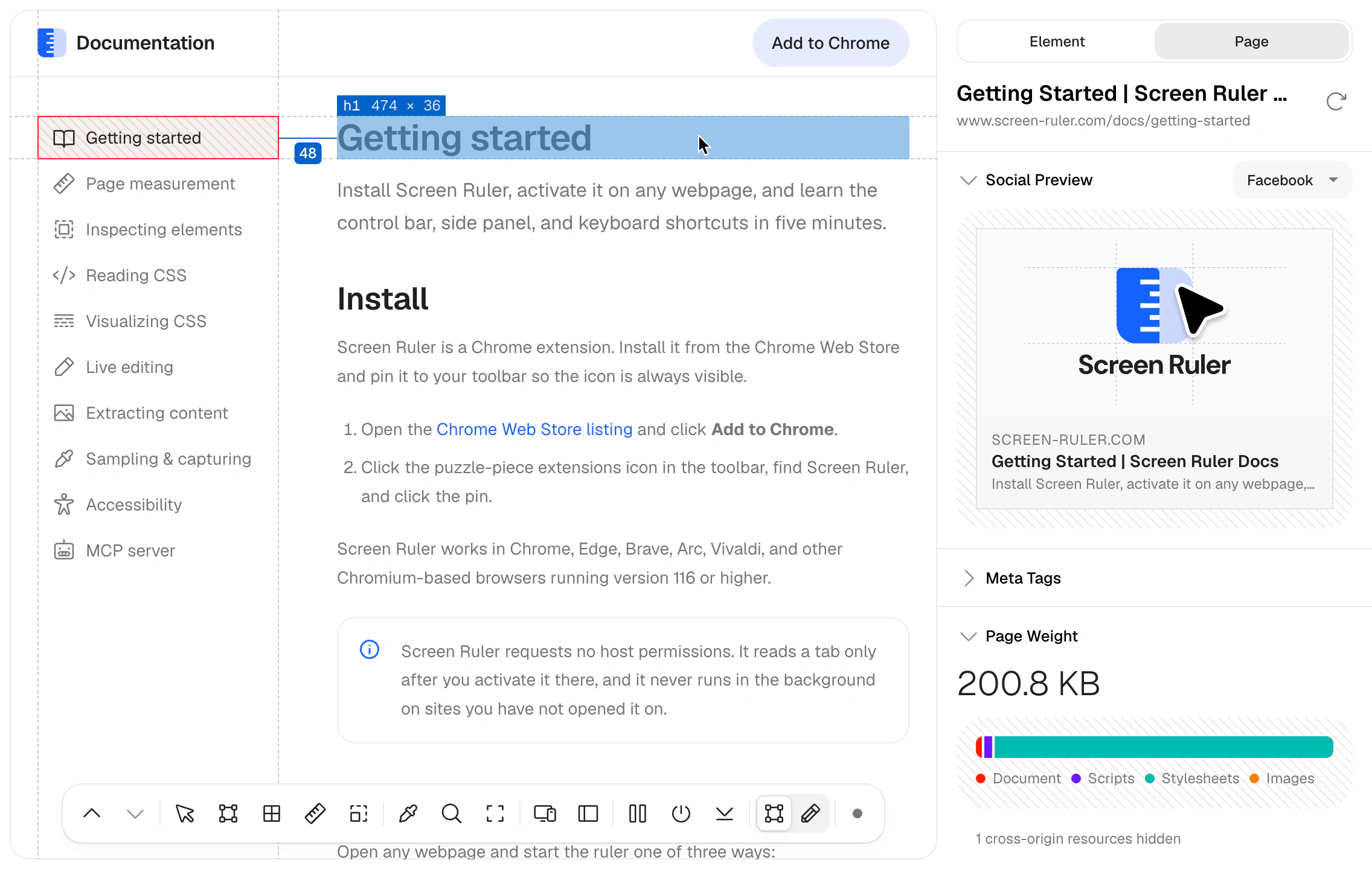
Screen Ruler: measuring a webpage

Designing the inspector

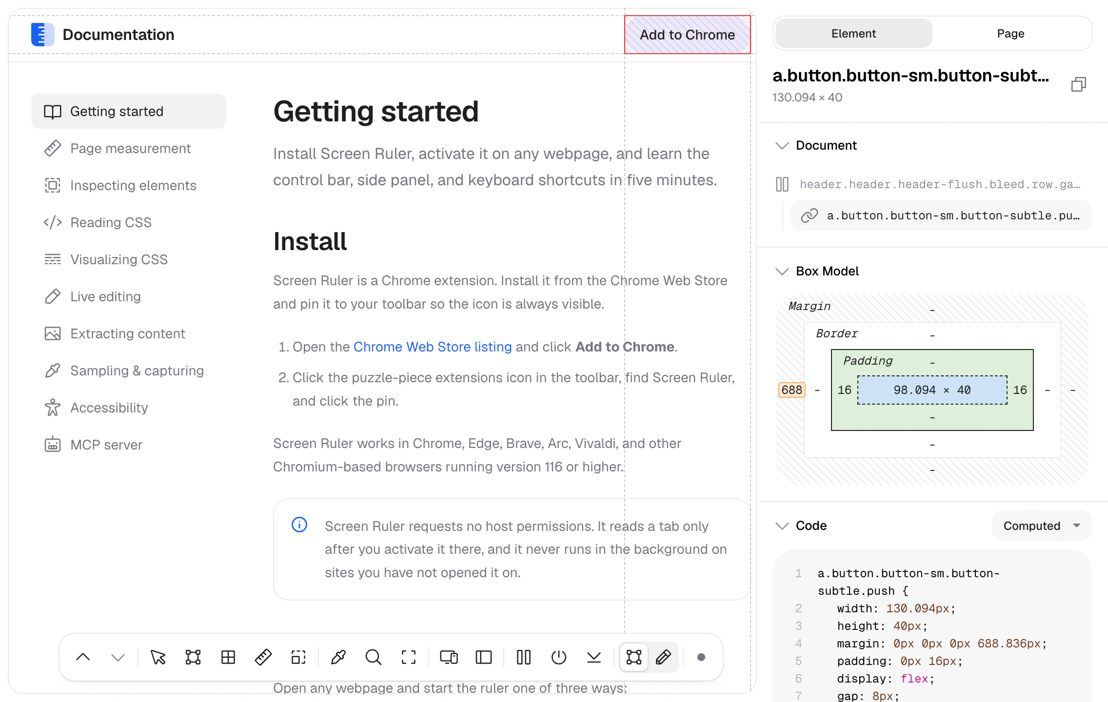
I borrowed the measurement overlays from what I liked about Zeplin. You could point at an element and see its dimensions and spacing on the page. The side panel let me show the CSS behind it too.

The box model had a familiar diagram I could use. Flexbox was harder; there were few established components for showing how a layout worked. I had a lot of fun designing those, working out how to show the relationships between elements visually.

The panel is tall and thin, which suits a list of properties. Visualisations and code need more width. I had to work out how much to show in each component and how to group it so the panel stayed readable.

Screen Ruler: inspecting an element

Adding CSS editing

People kept asking how to edit the elements they were inspecting. I’d thought of Screen Ruler as an inspection tool, but editing made sense as the next step.

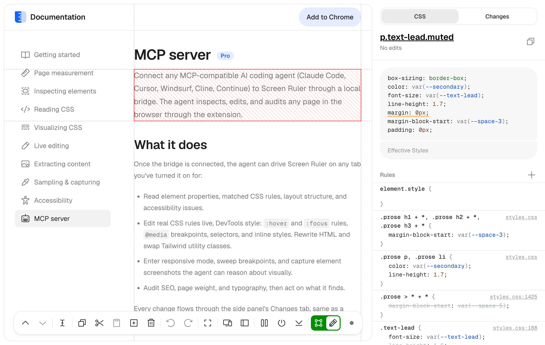
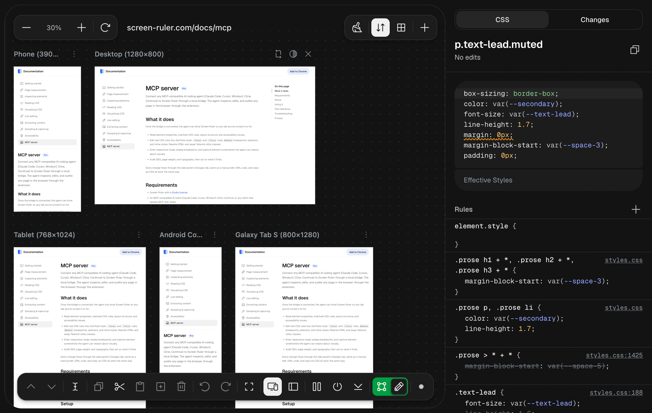
The editor starts with Effective Styles: one winning value for each property on the selected element. The underlying rules sit below, so you can see where a value comes from and edit a rule that affects more than one element.

I wanted the editor to fit into the same narrow panel and keep the selected element in view. A separate Changes tab tracks the edits so you can try things on the page and take the changes back to your code.

“This consolidates multiple extensions into one powerful tool. As a web designer, I can't express just how happy I am that this replaces my need for several standalone browser extensions.”

Victor Chinedu · Gumroad review
Screen Ruler: editing a webpage

Keeping the tools readable at any zoom

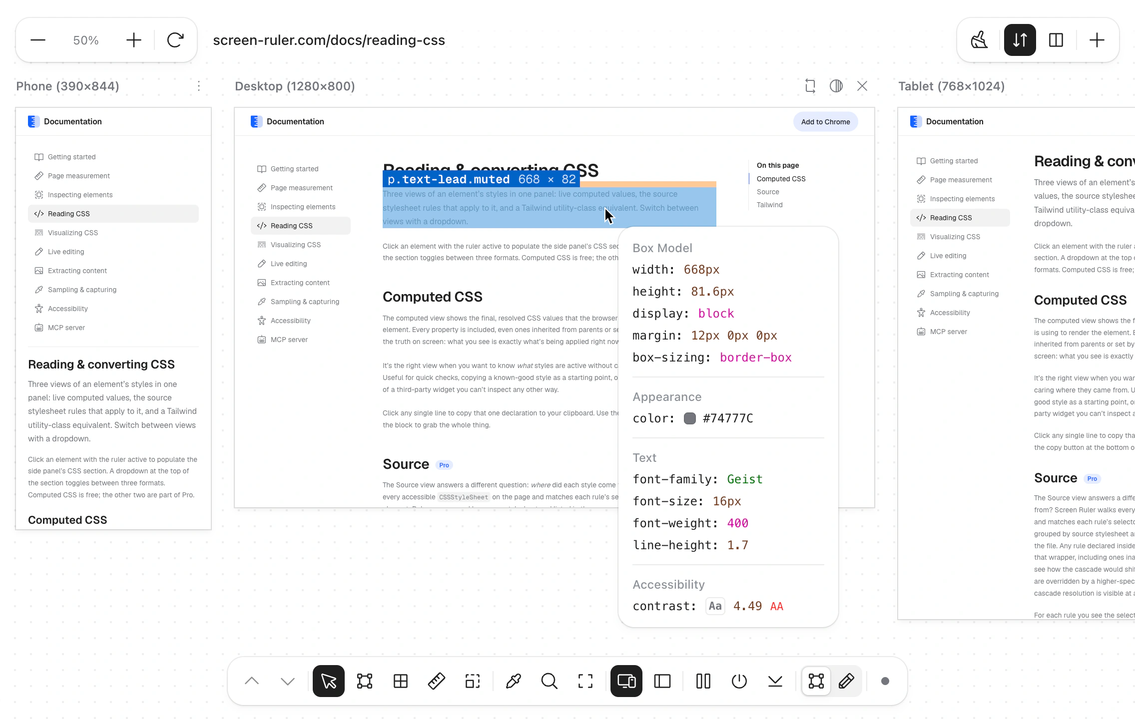
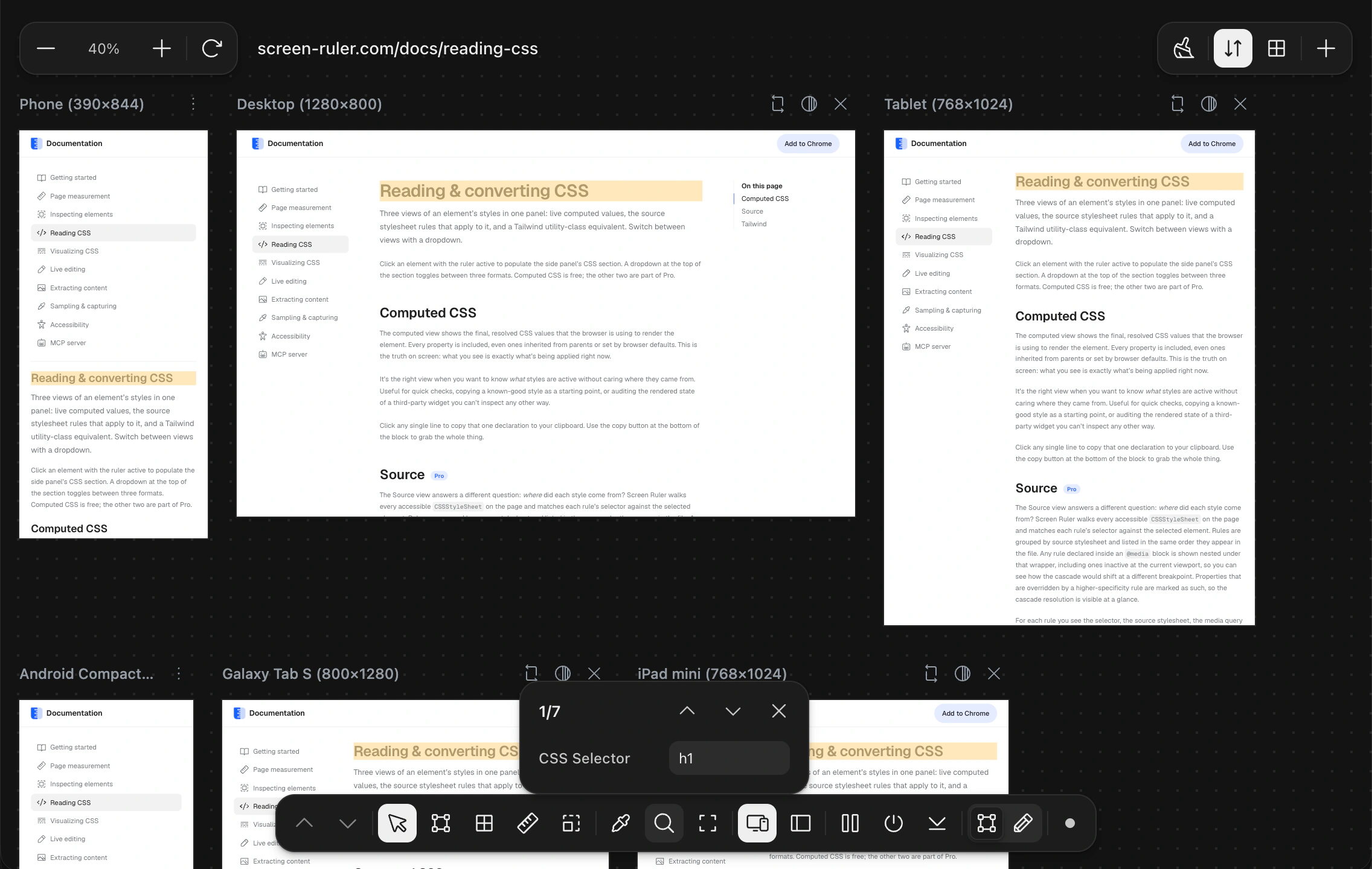
Responsive mode began with one frame as a proof of concept. An iframe let me set the page’s dimensions, then scale it down to fit the workspace. Unfortunately, that also made the measurement lines and labels tiny.

I scaled the overlays up by the same amount the frame was scaled down. When the frame is at half-size, the overlays are twice as large inside it. They appear at their normal size in the workspace, even as you zoom out.

I also wanted the floating inspector in the outer interface so it could extend past the frame’s edges. Once the cursor enters an iframe, the outer page stops receiving its mouse events. The frame has to report the cursor position, which I then translate into coordinates in the workspace.

Positioning the inspector outside the frame
const rect = hoverSlot.getBoundingClientRect();
const topX = rect.left + (message.x / message.vw) * rect.width;
const topY = rect.top + (message.y / message.vh) * rect.height;
this.positionInspectPanel(topX, topY);

This maps the cursor’s position inside the frame to its position on screen. The frame’s visible bounds account for zoom and scrolling, so the inspector can keep following the cursor as the canvas moves.

Floating inspector over scaled responsive viewports

Editing across multiple frames

Editing had to work inside the frames too. The CSS rules belong to the page inside each frame, while the editor lives in the outer interface. I needed communication in both directions to show the current styles, send edits back, and update the panel.

Adding multiple frames complicated it further. The inspector had to follow the viewport you were working in, and shared CSS edits had to reach the others. New frames also needed to pick up any edits you’d already made.

I wanted people to compare widths and edit CSS in the same workspace. Keeping the frames and editor in sync took a lot of work, but now you can move between them without setting everything up again.

“I actually convinced my company to buy Screen Ruler. Now both me and two of our front-end engineers use it daily. It's become a genuine replacement for the browser's dev tools…”

Vraj Shah · Peec AI
Find mode in Screen Ruler’s responsive workspace
Editing CSS in Screen Ruler’s responsive workspace

Growing Screen Ruler

Screen Ruler grew through word of mouth and was featured in Google’s Chrome Web Store monthly spotlight. It’s reached 100,000 installs and 5.9 million store impressions, with more than 60,000 weekly active users.

It was my first JavaScript project. Seeing that many people use it has been a good reason to keep working on it.

Weekly active users
Screen Ruler weekly user growth, March 2024 to July 2026 Monthly median weekly users grew from zero to approximately 64,000, with fluctuations along the way. The chart ends in July 2026. 0k20k40k60k Mar 2024May 2025Jul 2026

March 2024 to July 2026. Monthly medians of daily weekly-user counts from the Chrome Web Store.

Building the website

For a long time, Screen Ruler only had a Chrome Web Store listing. I built a landing page to explain the extension and bring in traffic from people searching for tools like it.

I worked on SEO and added content about tasks like inspecting fonts and editing live webpages. People could find those pages when searching for help with a task, even if they’d never heard of Screen Ruler.

In three months, Google Search brought around 2,000 clicks and 121,000 impressions. Average daily clicks more than doubled between the first and last full weeks, and impressions grew to over four times their starting level. Most people still discover Screen Ruler through the Chrome Web Store.

Google Search traffic
Google Search clicks and impressions, June–September 2026 Seven-day rolling averages from June 21 to September 14. Daily clicks rise from about 14 to 33 and impressions from about 470 to 2,200. Clicks use the left axis, impressions the right. ClicksImpressions 0 0 20 1k 40 2k 60 3k 21 Jun2 Aug14 Sep

Google Search Console, 15 June to 14 September 2026. Seven-day rolling averages start on 21 June. Clicks and impressions use separate scales; totals cover the full export.

Next project Editor — Day One