WordPress's mobile stats show millions of site owners how their sites are doing ✳︎ I redesigned them across iOS and Android.
A stats page full of zeros
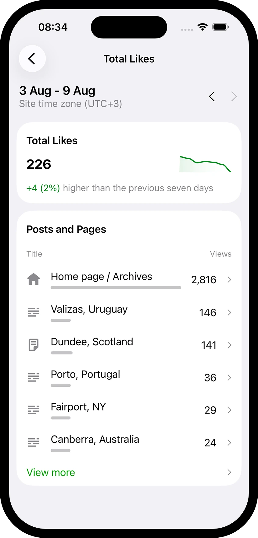
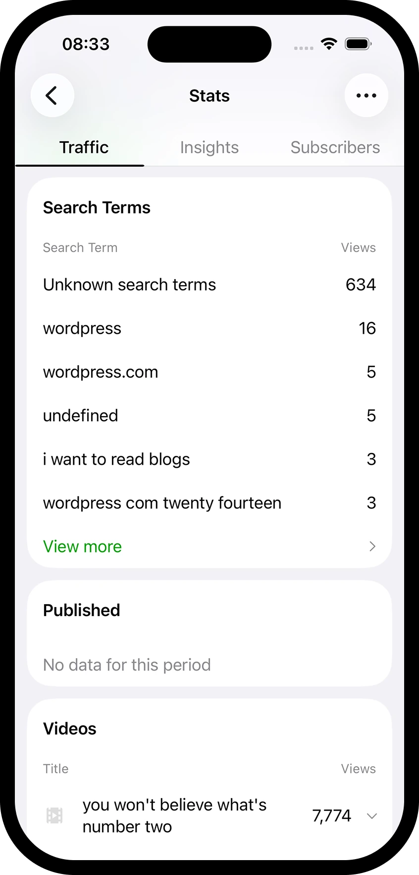
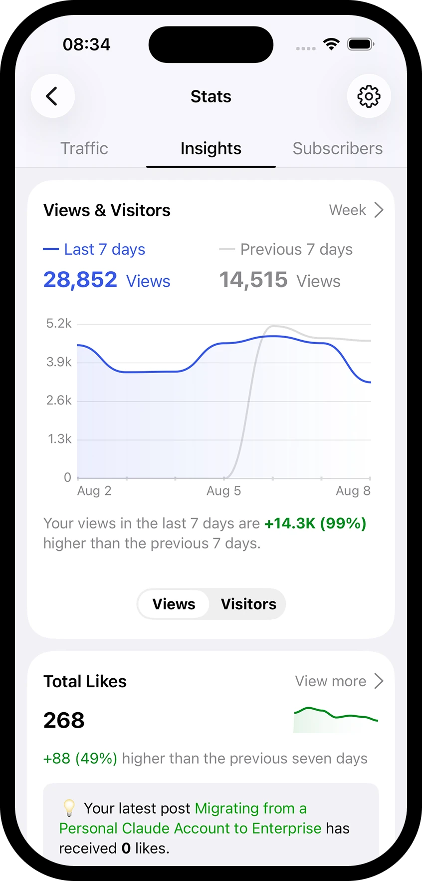
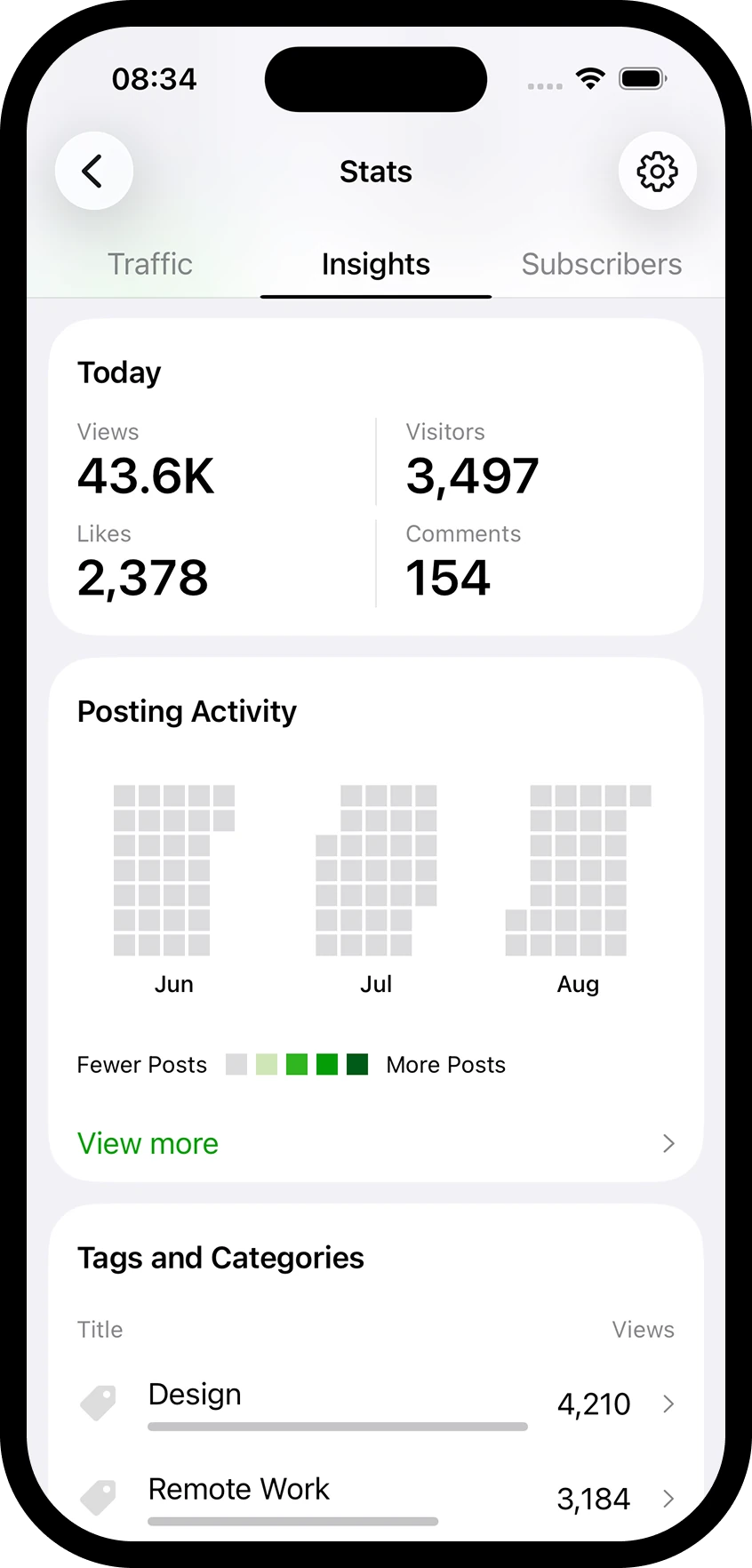
New sites have no data, so the old stats page greeted people with zeros and empty cards. The brief was to never show a zero. I tried it and realised hiding the truth was too much hand holding. When someone goes looking for their numbers, they need to see what's actually there, even when it's nothing. So instead of one rule, I designed three card types. Hint cards replace a dead card with something to do. Conditional cards show only the rows that have data. Full disclosure cards always show everything. Users could pin the cards that mattered to their site, and after the first bit of activity, Today's stats is pinned for everyone so nobody meets an empty screen twice.
Testing on the streets of Eastbourne
Some interaction questions don't get settled in Figma. When it wasn't clear how pinning cards should work, I built two prototypes, one driven by an ellipsis menu and one by dragging rows, and took them out into Eastbourne to test on strangers. It was a small test and a complete landslide. Everyone tried to drag first, and one person got so stuck in the menu version they never finished the task. The time period control got the same treatment. I asked people what they'd press to see their stats from May 4, 2018, and a dedicated date bar clearly beat the existing tabs. Both results shipped.
The launch got roasted
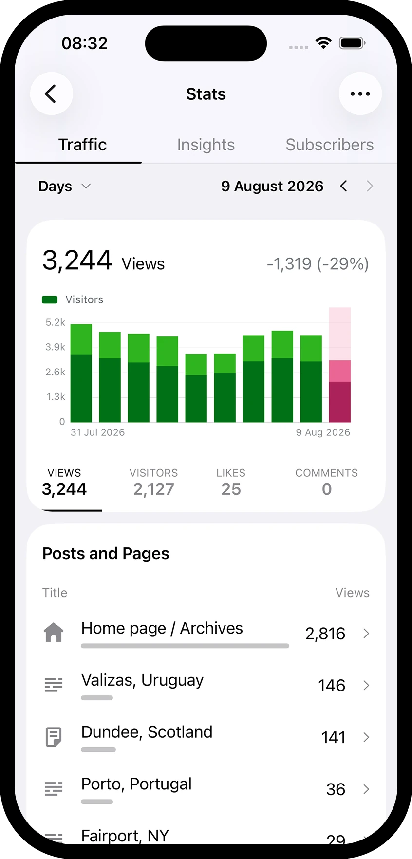
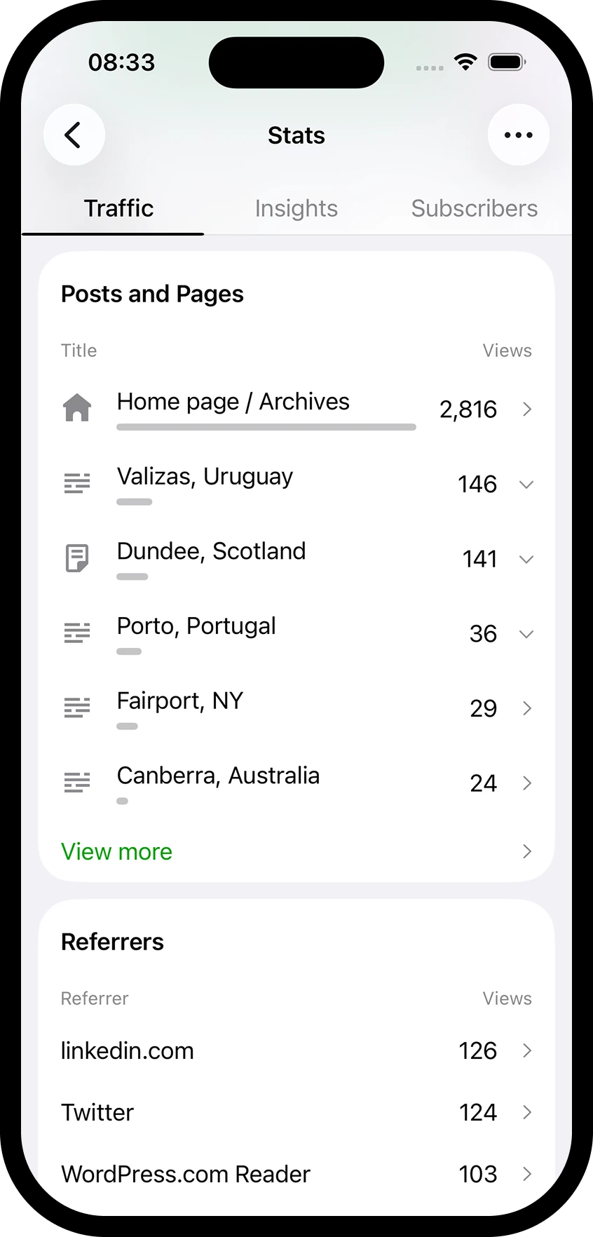
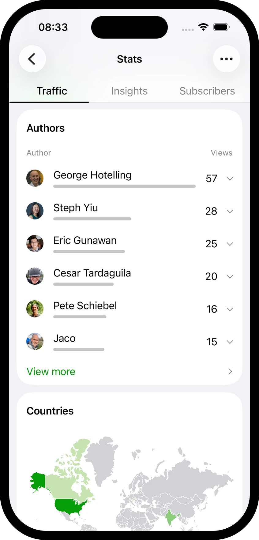
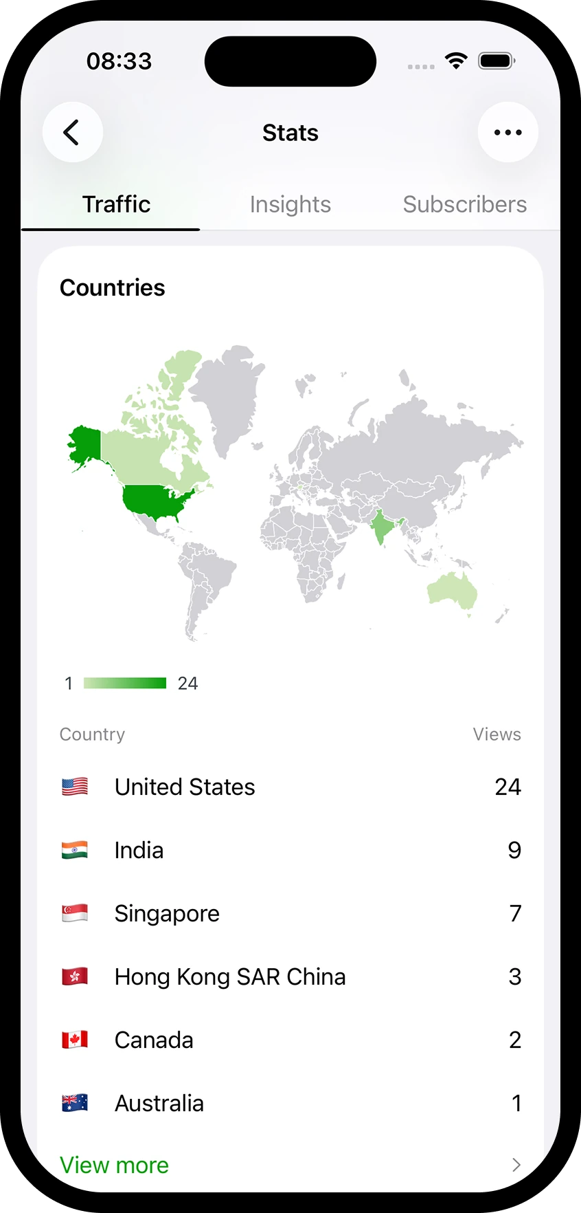
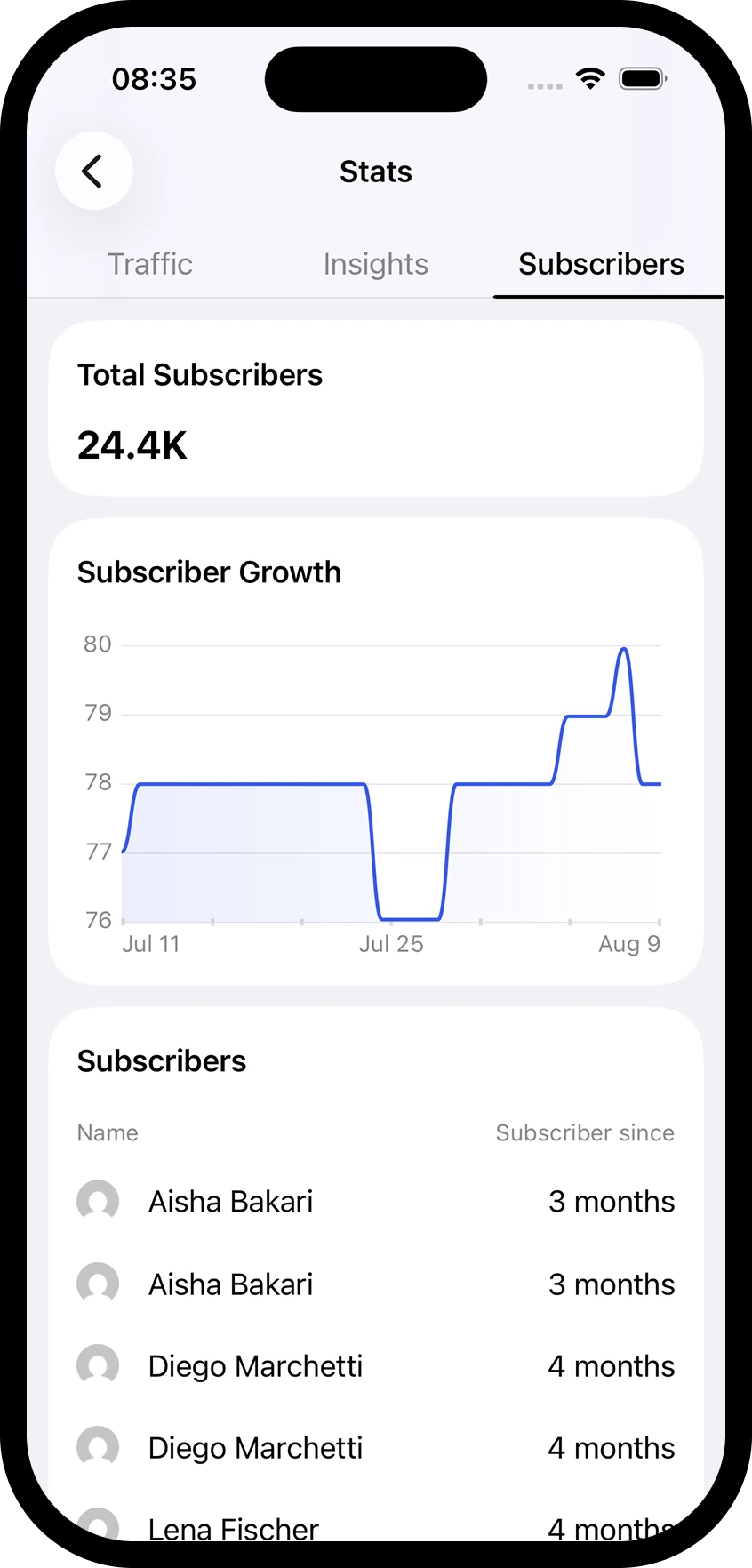
The redesign went out on Android in 11.5 and the feedback arrived fast, in Play Store reviews and on Twitter, and not all of it was kind. I boiled the complaints down to real problems and answered each one. The interface felt muddled, and after a pile of explorations the cause turned out to be the lack of any visual cue where one block ends and the next begins, so I borrowed the enormous section titles Google Analytics uses to cut through its data. Abbreviated numbers were hiding figures people cared about, so full numbers came back where they matter and abbreviation starts at 9,999 instead of 999. And people kept getting lost, so the time period control became a bar that stays fixed while everything else scrolls away.
Looking sideways at Squarespace
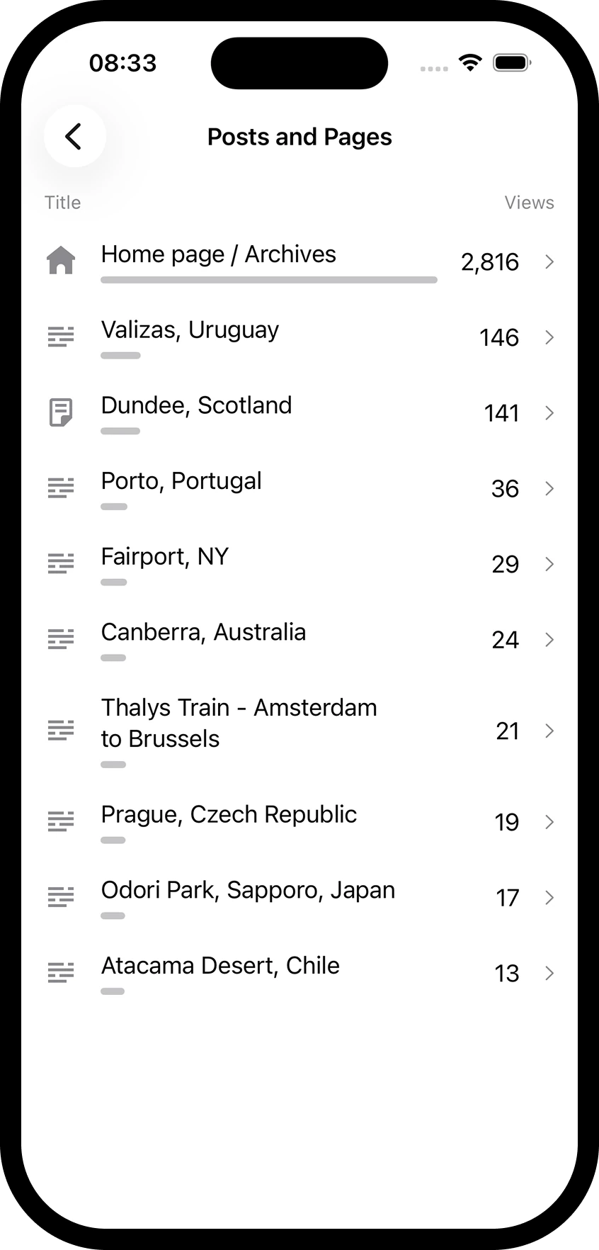
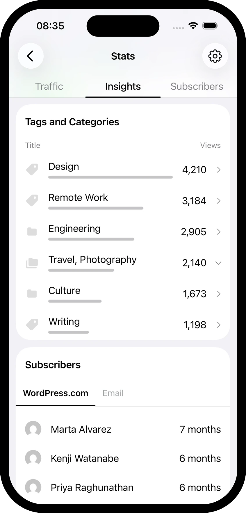
I also spent time in Squarespace Analytics, the best-rated competitor on both stores. What stood out was how visual it is, using bars for quick comparisons where we had rows of numbers. That review produced bar rows in our tables, neutral tabs in place of accent blue everywhere, and a line chart that ghosts the previous period behind the current one so growth is readable without reading a number. When Automattic later split its apps, stats moved over to the Jetpack app entirely, where they ship today. The WooCommerce app built its stats on the same framework.