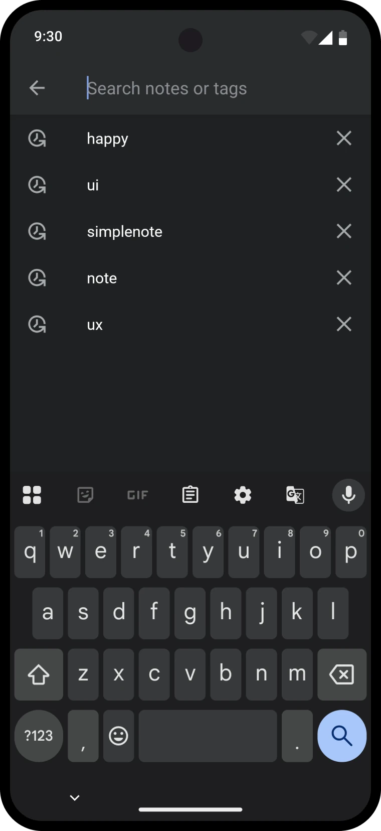
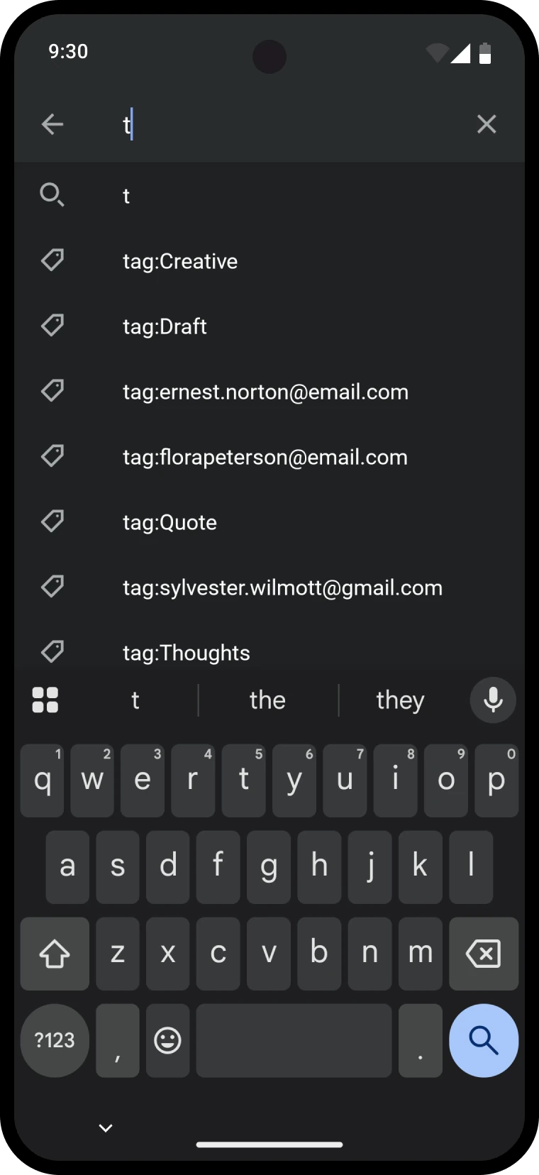
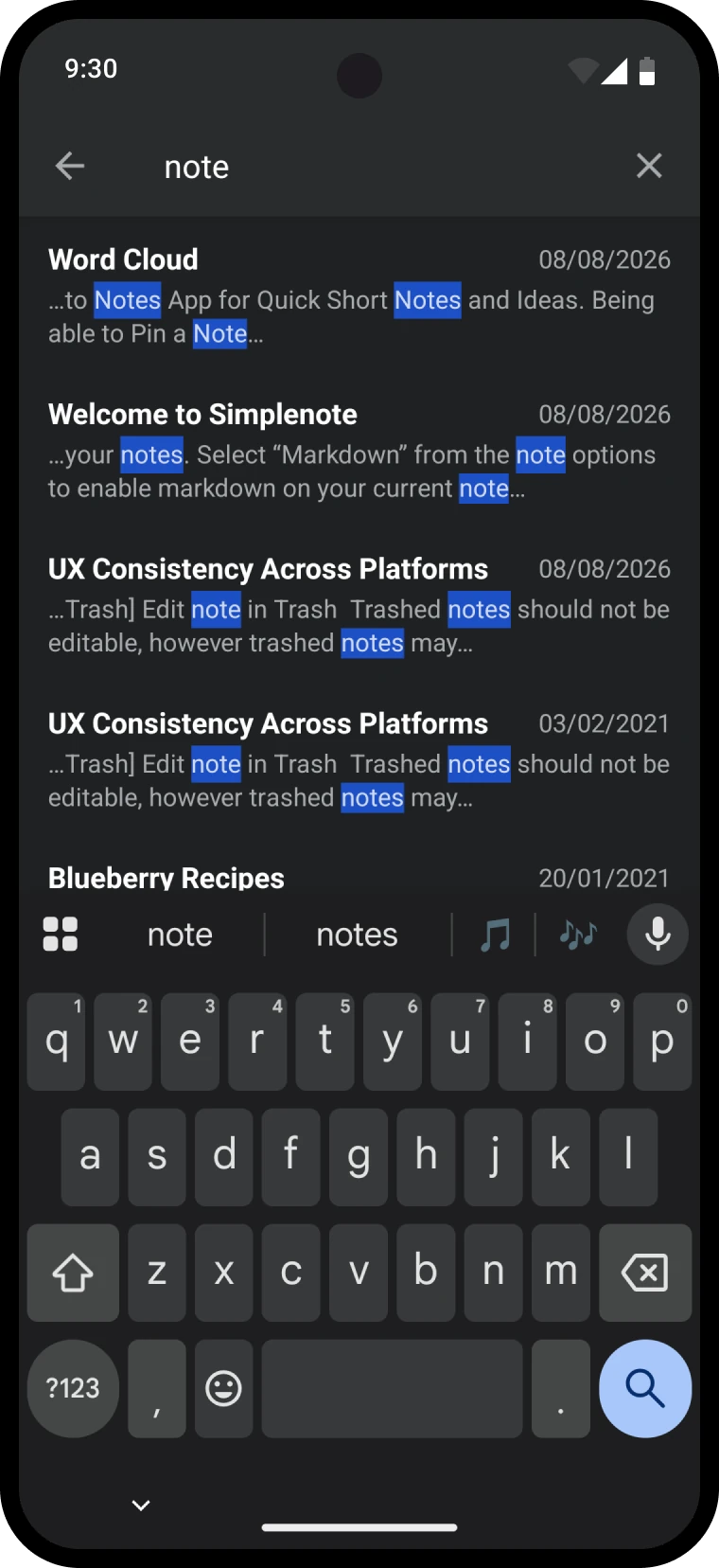
Simplenote is Automattic's fast, free notes app ✳︎ I designed it across every platform and helped decide what got built next.
Running the roadmap
At the start of one year we planned the roadmap as a team, and I helped drive it. We started from the business goal for the year and ran an impact mapping exercise, working from the goal to the people who could move it, the behaviours we wanted them to adopt, and finally the projects that might cause those behaviours. Every proposal then went onto an effort versus impact matrix. The low effort, high impact quadrant became the immediate work, the high effort, high impact quadrant became the year's big bets, and the rest waited.
Reversing my own shipped design
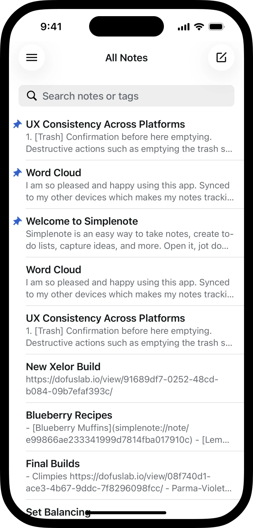
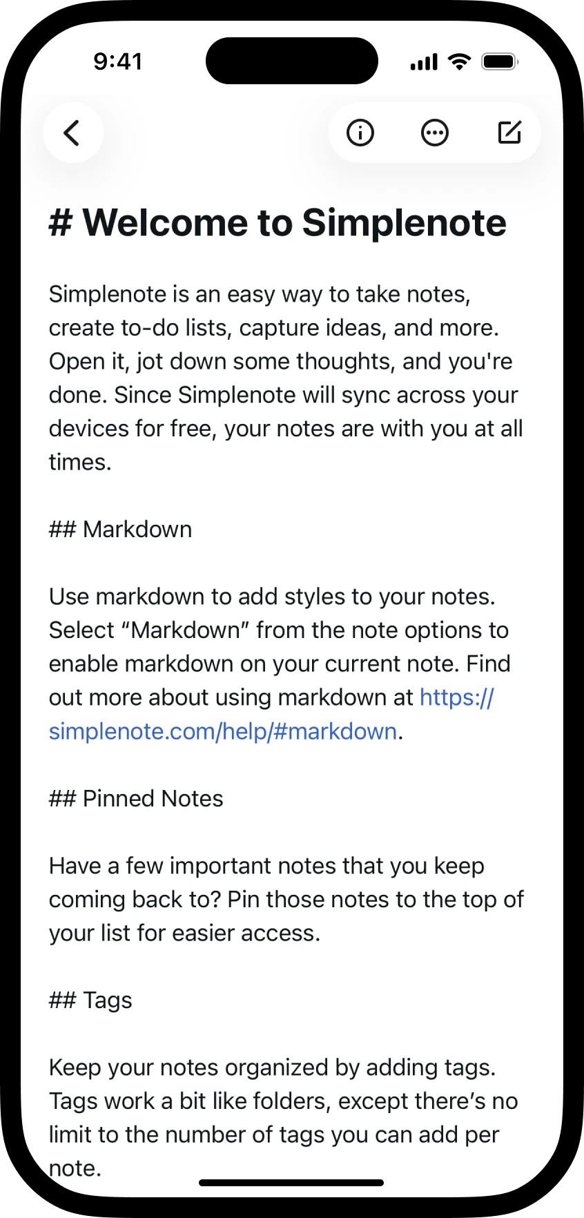
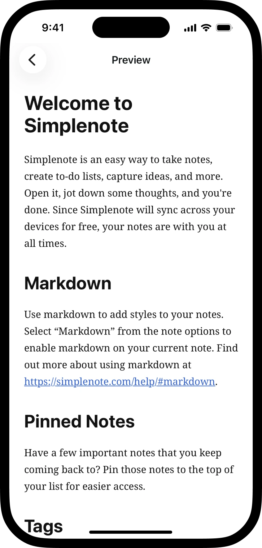
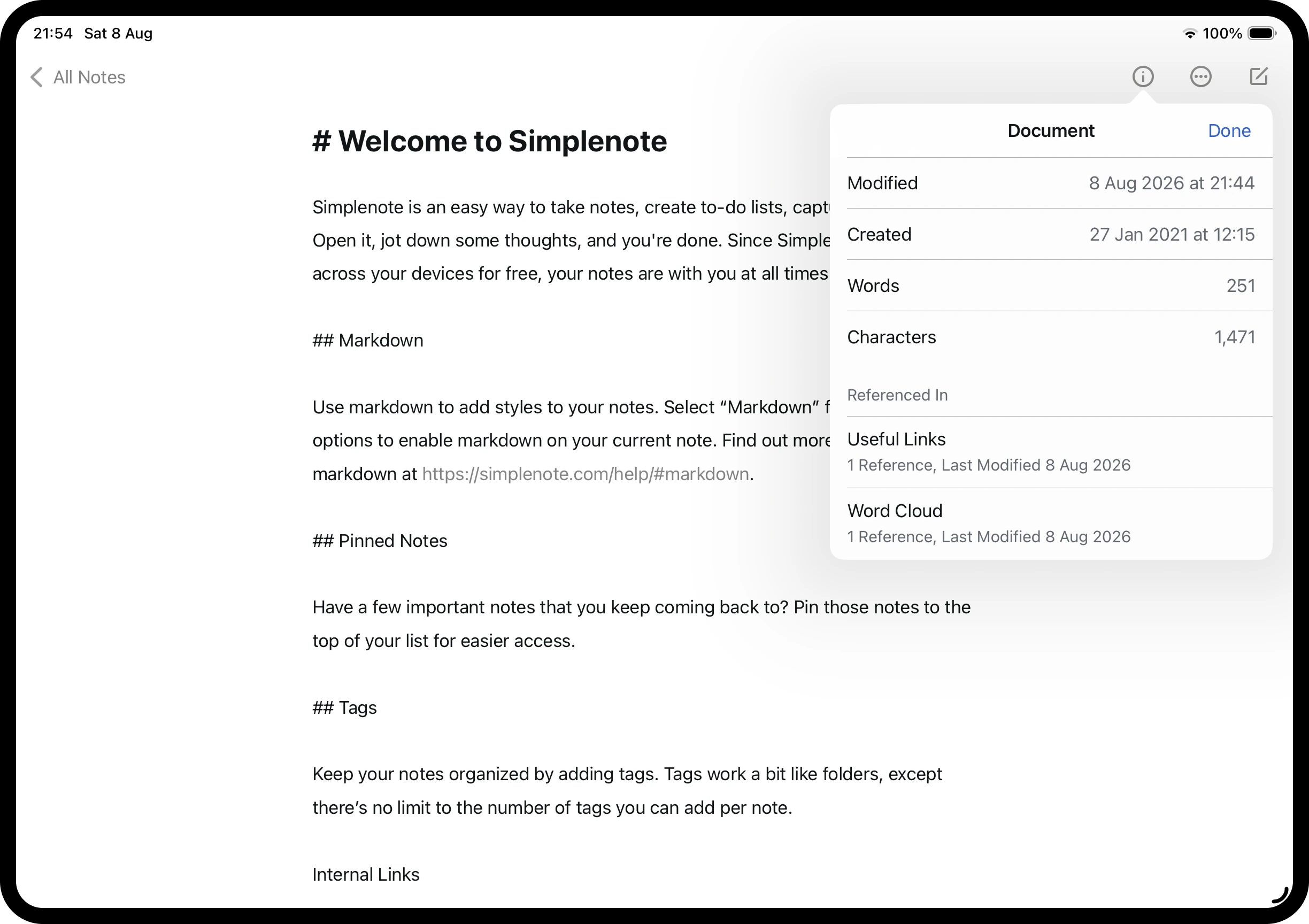
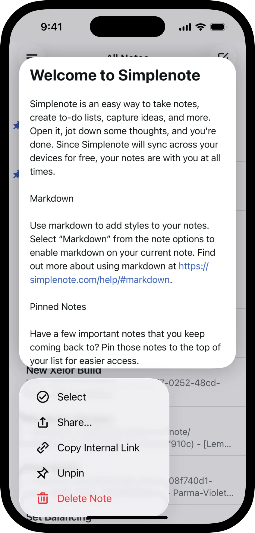
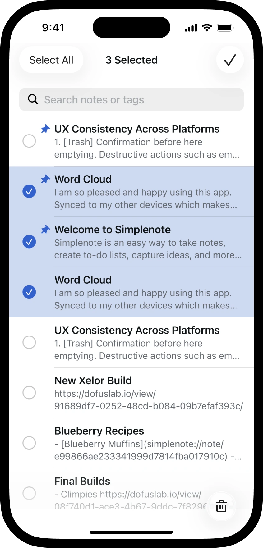
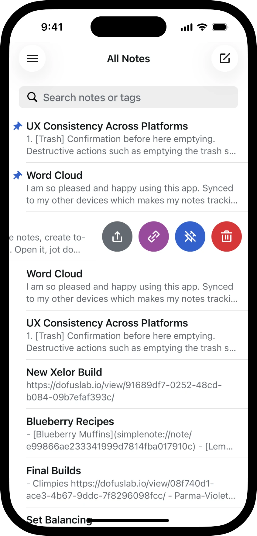
In 4.36 we moved the new note button into an action bar fixed to the bottom of the screen. The reviews were brutal, mostly variations of it taking up too much space. Store reviews are a biased sample though, nobody rushes to write one saying the new bar is amazing, so before acting I tested whether the critics were right. A preference test came back 72 to 28 against the bar. I re-ran it targeting only mobile users, where the button's reachability should have counted for something, and the result was identical. And when I asked 25 people how they'd select multiple notes, almost half described a long press without being prompted. The new note button went back to the navigation bar, and multi-select moved behind a long press in the list.
Small tests for small decisions
Plenty of Simplenote decisions were too small for a research project and too contested to settle by opinion, so quick tests became the default. I consolidated seven sorting options into four with a reverse toggle, then verified the design on Usability Hub by asking people to sort search results oldest first and reading the tap heatmaps. Truncated tag lists got a +6 button after a word cloud showed people understood it. The rules for which note stays selected when you search, trash, or switch tags came from surveying what people expected to happen. And when Craig Mod told us on a call that keyboard control on the Mac kept stranding his cursor, we redesigned keyboard navigation so the cursor never needs a mouse to recover.